
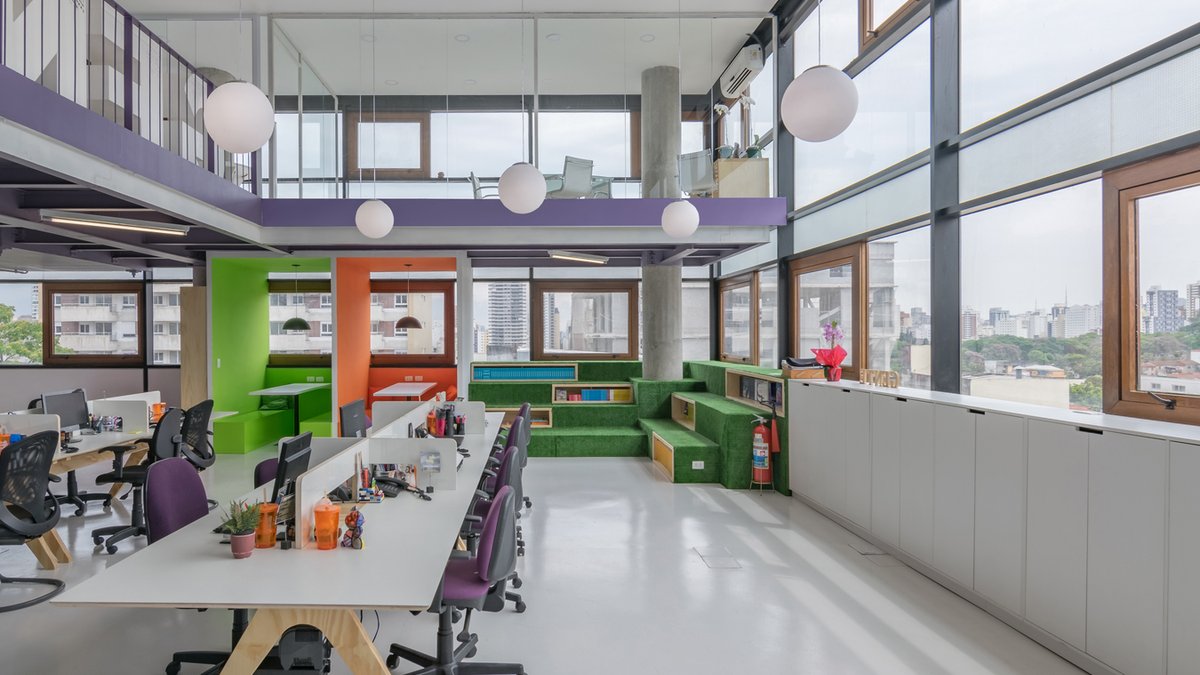
Workplace colour schemes were once largely driven by aesthetics and brand identity. Today, they are increasingly shaped by a broader set of priorities, including employee wellbeing, workplace experience and sustainability. As organisations rethink what employees need from the office, colour is becoming a strategic design tool rather than simply a decorative finish.
Specifying purposeful colour
One of the most notable trends is the move towards more purposeful colour specification. Rather than applying a single palette across an entire workplace, designers are tailoring colour schemes to the specific function of different spaces. Collaborative areas often benefit from more uplifting tones that encourage interaction and creativity, while spaces designed for focused work typically call for calmer, softer shades that help reduce distractions and support concentration.
This approach recognises that today’s modern workplace serves multiple functions across the building and throughout the working week – from collaboration and social interaction to focused individual working. The most successful schemes recognise that there is no single colour solution for every environment. Instead, colour is being used to create experiences that feel appropriate to both the space, its intended use and its users.
Related: Roar Studio Designs Chicago Law Office Rooted in Local Context
Designing for comfort and connection
As organisations continue to adapt to hybrid working, the office must offer something employees cannot replicate elsewhere. This has placed greater emphasis on creating spaces that feel welcoming, comfortable and engaging, helping to make time spent in the workplace both productive and worthwhile.
Employees increasingly judge the workplace against the wider environments that they experience every day, whether that’s home, hospitality venues or shared social spaces. This has accelerated demand for softer, more residential-inspired colour schemes that help support a greater sense of comfort and belonging. Crisp, clinical environments are giving way to palettes that feel familiar and lived-in, prioritising a feeling of ease over strict corporate uniformity.
Crucially, colour is most effective when considered as part of a wider design language. It’s not simply about the colour on the wall, but how that colour interacts with materials, finishes, lighting and furniture to shape the overall workplace experience. We’re also continuing to see the influence of biophilic design. Nature-inspired colours, particularly greens, soft blues and muted earth tones, remain popular choices as organisations look to strengthen the connection between people and their surroundings. However, colour alone cannot deliver this outcome. The most effective workplace schemes consider colour alongside materials, texture and lighting to create a cohesive sensory experience.


